


PROJECT BRIEF
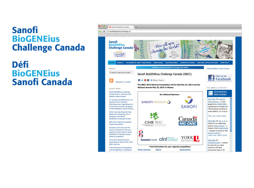
The client came to us with the task of rebranding Sanofi BioGENEius Challenge Canada, which included a new visual identity, responsive website and marketing strategy.HIGHLIGHT
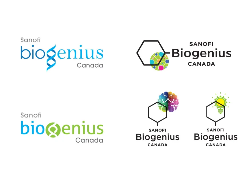
Snack suggested that the client seize the opportunity during the rebrand process to simplify the name of the program to make it all-emcompassing – SBC is actually a multi-facetted program, of which one aspect is a science competition – and to alleviate the bilingual issue.This involved changing the spelling of “BioGENEius” and removing the word “Challenge”. The client agreed, and now – in addition to the program name being more straightforward – one wordmark and its acronym “SBC” serves both English and French audiences.
ROLL-OUT INCLUDED
• stationery package• sponsorship brochure
• direct mailer
• posters
• responsive website
• PowerPoint templates
• Word templates
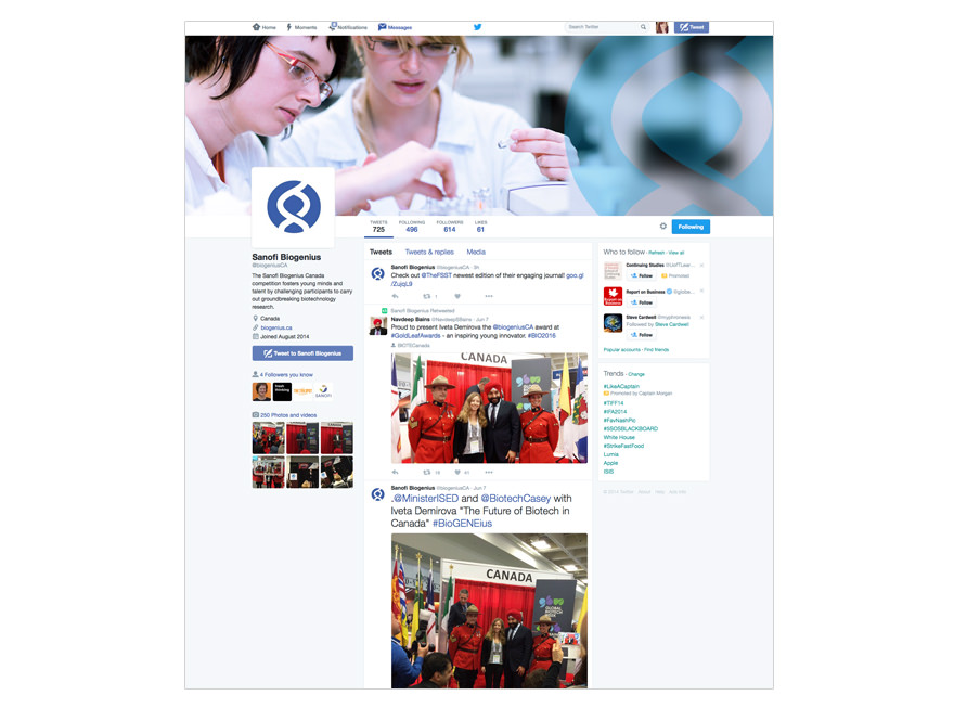
• social media graphics