design

Three Men in a Hot Tub: Gone And (hopefully) Soon Forgotten by Samantha Murray

When the provincial government announced plans for a redesign of the Ontario logo, I was torn. Of course, I was all for leaving the current trillium logo behind (goodbye, neutered and dismembered sprites! No more Three Men in a Hot Tub!), but felt the timing was off, considering the news of so many cuts in the upcoming budget.

A price tag of $89,000 might sound steep for a redesign, but one would assume it also covers the brand story and guidelines. However, a larger and separate cost would involve rolling the new logo out across every new poster, sign, brochure and other collateral. I’d rather our tax dollars be spent on education and healthcare.

However, I was still curious. I anxiously awaited my first sight of the logo. Would it still be a trillium? Would they use a weird font? Finally, a tweet – and it was revealed. And I was somewhat...relieved? Rather than a complete overhaul, they went back to basics. It’s not exactly the same as the iconic 1972 version by Glenn Fretz and Ernst Barenscher, but it’s pretty close. I appreciate that they didn’t reinvent the wheel, that they seemed to appreciate how iconic the pre-2006 version was, and I suppose – simply added their one cent.

While looking for the history behind the evolution of the trillium logo, I found this thread covering the who, what and when.

http://canadiandesignresource.ca/graphics/logo/ontario-provincial-logo/

What struck me was Fretz’s description – and the craftsmanship involved – in creating the trillium mark:

“I constructed the trillium from six overlapping circles in 60-degree increments to create a pinwheel. The alternating negative and positive shapes at the centre were identical in shape. The leaves were simple geometric projections from the pinwheel core. I recall that getting the radii to intersect seamlessly during the construction of the super-ellipse was a daunting task — particularly with ruling pen and compass on a 2-foot square piece of illustration board. I also recall the process of resolving an effect created by the tips of the upper two petals of the trillium and their proximity to the ellipse. An optical illusion made the shape look distorted — squeezed in at the top. By carefully manipulating the position of the trillium within the ellipse, the effect was minimized. Upon reviewing my work, Barenscher declared that it was a ‘perfect solution.’”

This is how a classic icon is made, and it stands the test of time.

Posted by Samantha

The comeback kid: magazines by Samantha Murray

Magazines. We read them. We love them. We love designing them. And they are making a comeback as brands are looking for ways to make connections with their customers that are lasting and more tangible.

Magazines offer a deep level of customer engagement that can only be achieved with the right mix of authentic, valuable and relevant content directed toward a brand’s specific audiences, and their particular interests and tastes.

A beautiful example of content marketing gone right is the Union Pearson (UP) Express’ magazine, titled: On the Up. Being the first air-rail link to welcome locals and tourists to Toronto, UP was able to develop, curate and deliver content to its passengers all about the city of Toronto. In this unique position, UP becomes a thought leader and is able to partner with and feature unique places and spots to visit around the city. With its cute size, the magazine is not quite a pocket travel book but it is small enough to throw in a carry-on or purse to keep for future reference.

Image credit: winkreative.com

Image credit: winkreative.com

LCBO has been creating noteworthy content for its customers for years with Food & Drink Magazine, with how-tos, tips and food and drink recipes that encourage a lifestyle of entertaining, made better with LCBO products. Big players like Walmart have recognized the value in providing their customers with content that feels different than their product flyers and catalogues. They developed their own store mag called Live Better, with print copies available at the store checkout lanes. Live Better is full of content that talks about everyday household situations made easier with Walmart products.

image credit: facebook.com/livebettermag

image credit: facebook.com/livebettermag

Last month, Airbnb announced its new magazine: Airbnbmag. Airbnb doesn’t own property, but it does own a valuable share of the hotel industry – a network of enthusiasts who value a certain kind of travel experience. Its hosts and travellers crave an insider’s scoop to the cities they spend time in. With this unique position, Airbnb, in partnership with global publisher, Hearst, developed the premier issue, entirely devoted to Los Angeles, California. With 28 pages of content, this magazine is described as “real information for the world of Airbnb.” There are plans to release more next year, each issue being a tribute to a different city, with the expectation that it lives on the coffee table of hosts around the world.

Why has this new sector of publishing emerged?
Sarah Schaffer, content studio manager at HZDG advertising agency explains that with access to so much information, new “enthusiastic audiences interested in hyper-niched subject matter” have developed, opening the doors for this new arena of marketing potential. Sarah’s team notably created a niche-magazine called Sous-Vide for their client, Cuisine Solutions. Instead of a traditional ad campaign, Cuisine Solutions decided to invest their efforts into an ad-free brand publication, which was chock-full of fresh content developed by the advertising agency.                                                   

image credit: adweek.com

image credit: adweek.com

Rather than pushing the traditional 12 issues a year model, brands are embracing a publishing schedule that is completely their own, where they can produce one or two magazines a year and create impact. This kind of freedom means publications are only going to get better and better. 

A designer's top 10 things to do in Israel by Samantha Murray

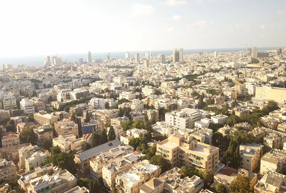
Israel is a hub of arts, culture and innovation, with a rich history. It is a country full of colour and diversity in every aspect of the word. Each time I (Jody) visit the country I am able to appreciate a new spot. Having just returned from an amazing vacation, I am happy to share my list of favourite things to do (and photograph) when exploring Israel’s two biggest and most contrasting cities: Tel Aviv and Jerusalem. 

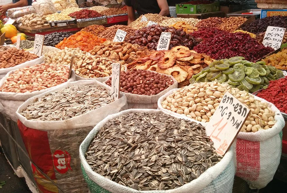
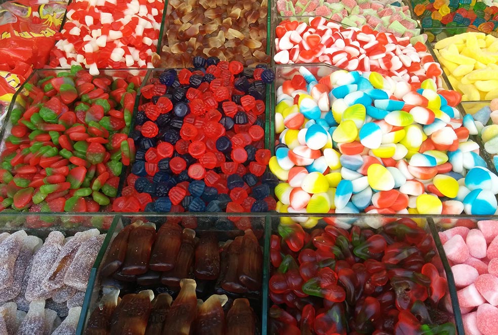
1. Take in the sights and smells of Jerusalem’s Machane Yehuda Market. The market is alive at all hours, but pay a visit mid-day for the best look at the plethora of nuts, dried fruit, produce, candy and baked goods available. Grab lunch at one of the many amazing restaurants tucked between stalls.

2. Visit the vintage and second-hand market at Dizengoff Square (Tel Aviv). On Tuesdays and Fridays, local collectors come together to sell their best finds to the public at this market, which parks itself in the centre of the city. Find everything from stamps to jewels to clothing and beyond.

3. Wander the streets of Florentin, Tel Aviv’s “Soho,” to see some of the best street art. This neighbourhood in transition is home to the city's young makers and doers, and is jam-packed full of delicious coffee shops, restaurants and galleries to lose track of time in. 

4. Walk along Dizengoff Street for designer boutiques, cafes and restaurants (Tel Aviv). Gawk at the windows full of Israeli designer wedding gowns, sip coffee or grab a stool at one of the many restaurants that line the street with outdoor seating.

5. Stop to do some chin-ups at one of Israel’s many outdoor “gyms” (Tel Aviv).  A run or walk along the Tel Aviv boardwalk can turn into a full-fledged workout if you stop and take advantage of an open gym. Completely free to use, these are stationed around the city to encourage a healthy lifestyle.

6. Find some shade under The Umbrellas Street Project in the historic Nachalat Shiva District (Jerusalem). A project installed by the city which was originally slated to run from June through October 2015 has become a permanent fixture. The 1,000-ish umbrellas protect pedestrians from the sun on this busy shopping street. It does not rain in Jerusalem during the summer. At all.

7. Similarly, find some shade under the streetlights in Valero Square (Jerusalem). A collection of four flower sculptures, titled Warde, inflate by yawning open when people approach them. The sculptures provide shade during the hot days and additional lighting at night in the public square. 

8. Take a walking tour of Tel Aviv to explore the Bauhaus architectural style or lose track of time in the Bauhaus Center, which doubles as a design store (Tel Aviv). The center runs walking tours of Tel Aviv, nicknamed the White City for the world's largest collection of white buildings in the Bauhaus style. Explore the gift shop for a wide array of city-related artwork and design pieces.

9. Spend some time browsing the flea markets, furniture stores and stalls in Old Jaffa (Tel Aviv). In the alleyways and small streets around the Jaffa Port  the most ancient port on the Mediterranean Sea  you will find art galleries, a flea market, shops featuring new and reclaimed furniture, restaurants, cafes and pretty much anything else under the warm Israeli sun.

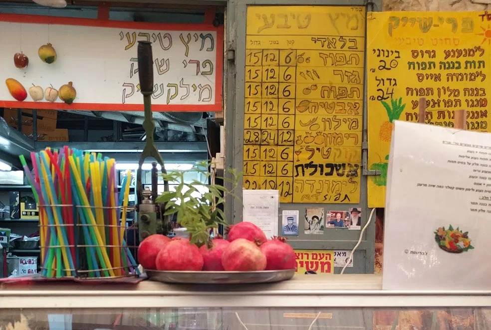
10. Have a fresh pressed juice at any corner around the city (everywhere). Juice stands mark the corners of every major intersection around Jerusalem and Tel Aviv. Enjoy a pomegranate juice or fruit smoothie, all made fresh to order.

Israel is an impressive destination for anyone who is content to wander. There is life, culture and good food at every turn. If you are planning a trip to Israel, feel free to contact me for some more tips at jody@snack.is. L'chaim!

Stop and think by Samantha Murray

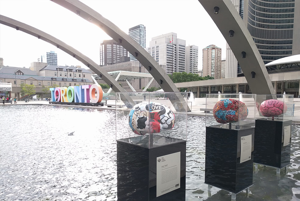
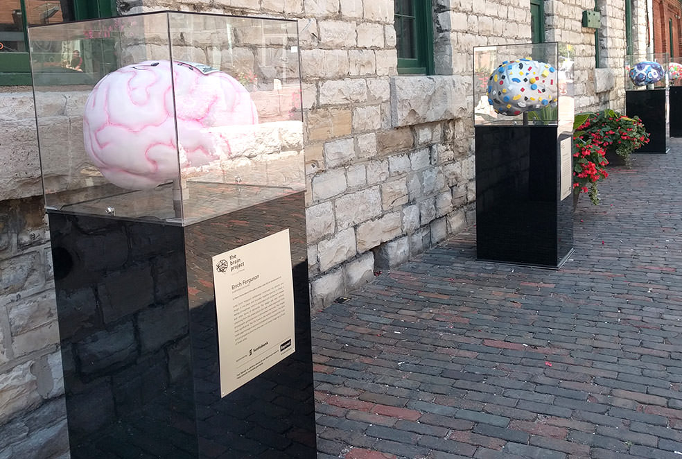
It is hard to ignore the giant brain sculptures that are lined around Toronto’s major downtown venues and public spaces, including our neighbouring Distillery District. And that’s the point.

The Brain Project is a public art exhibition that forces us to stop and pay attention to brain health. The brains, which were commissioned to and imagined by 100 artists are each entirely unique and thought provoking. After their stint on outdoor display, they will be sold to organizations and art collectors with proceeds supporting brain research at Baycrest Health Sciences.

Baycrest is a global leader in geriatric healthcare, research, innovation and education, with a special focus on brain health and aging.

The art exhibition was an idea sparked by donors who saw the power of art and design as a tool to spark conversation and raise money for an important cause. 

 “Art is not what you see, but what you make others see.” – Edgar Degas

Artists (left to right, top to bottom) Erin Rothstein, Donald Robertson, Darlene Cole and Alice Teichert, bring a unique visual approach to the ideas around active and healthy brains.

Artists (left to right, top to bottom) Erin Rothstein, Donald Robertson, Darlene Cole and Alice Teichert, bring a unique visual approach to the ideas around active and healthy brains.

On the grid: neighbourhood guides by local creatives by Samantha Murray

Design is storytelling. So who better to tell a city’s story than its designers, who live, work and breathe the neighbourhoods they are proud to call home.

Curated by designers around the world, meet On the Grid: neighbourhood guides by local creatives.

On the Grid offers a unique experience for locals and tourists alike to visit neighbourhoods in cities around the world, and explore its design communities’ favourites ­– everything from bars and sweets to parks and fitness. The project was started by design agency, Hyperakt, whose team wanted a platform to share their newly discovered neighbourhood gems after moving into an office in the Gowanus neighbourhood of Brooklyn, New York. People around the world got excited about the opportunity to tell their own unique stories, and On the Grid has become a giant collaborative project that is continuing to grow. Currently, there are neighbourhood guides in over 70 international cities, with new cities curated every week. In Toronto alone, there are 19 neighbourhood guides, and five more “coming soon” curated by our fellow design studios.

The beauty of the guides is that they are casual in nature and accessible to anyone with Internet access. There is no hidden agenda, and it is all about sharing tidbits of information and honest reviews about how locals live and love their areas.

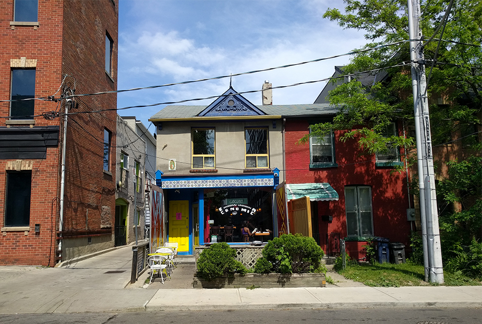
We are still newbies in our St. Lawrence/Distillery District neighbourhood but have definitely found some gems of our own. For the best Mexican food around, we head to Cocina Economica, and for a refreshing cold brew on a hot day, we look to Redline Coffee and Espresso. We also LOVE walking around the cobblestoned streets of the Distillery District with its array of shops, food and art to explore. 

We recommend checking out On the Grid for some inspiration before your next free weekend in Toronto, or before planning your next trip!