Design

Food Art Pairings: Are you hungry yet? by Samantha Murray

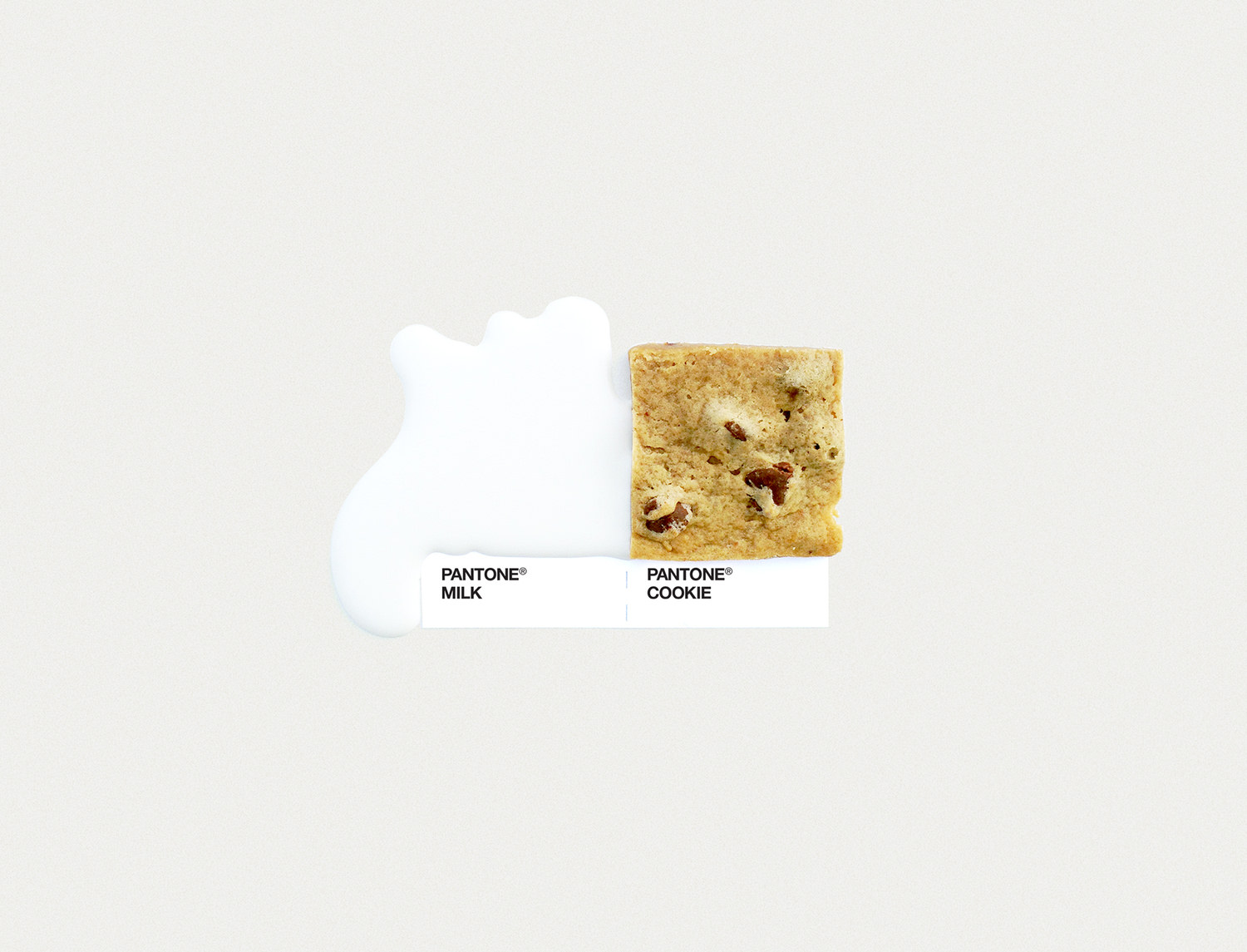
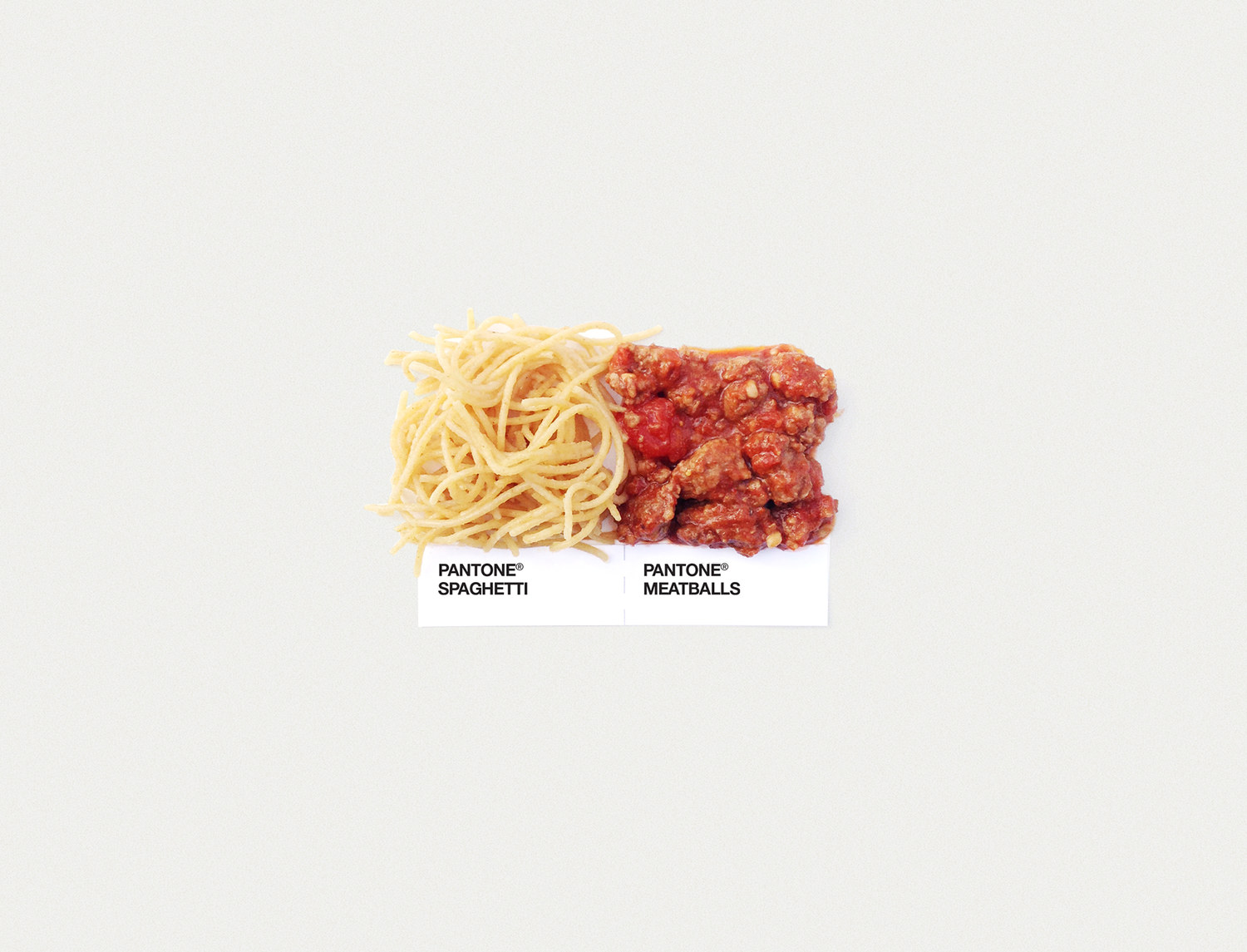
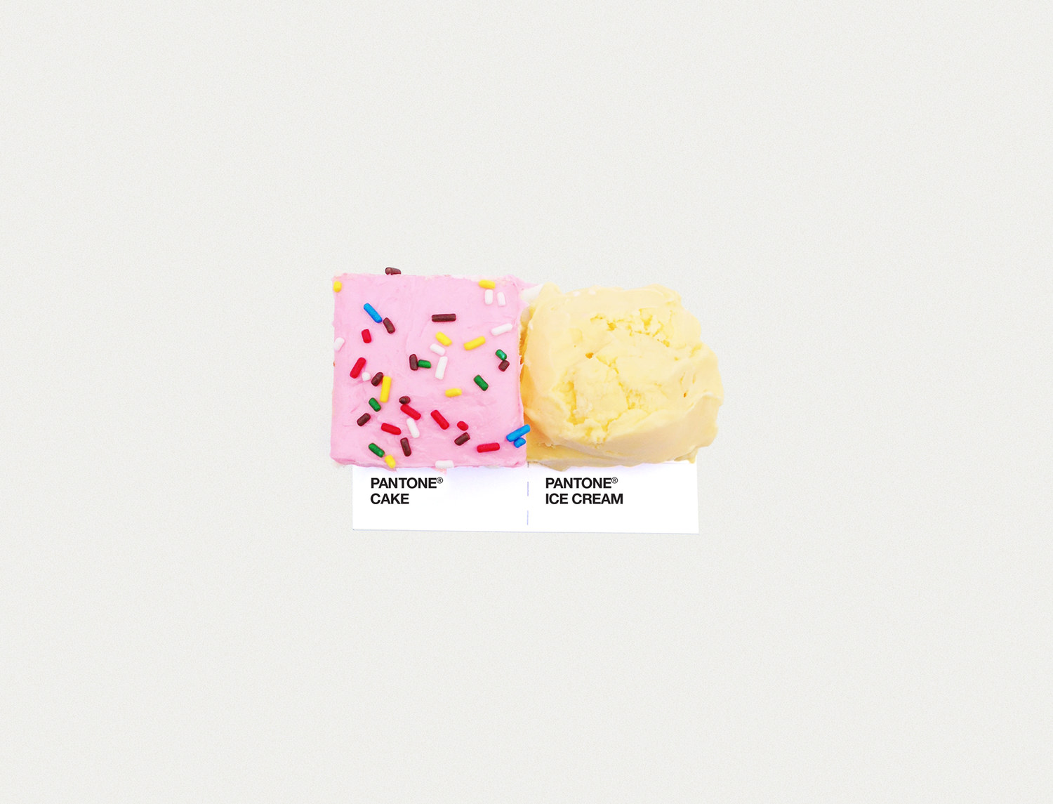
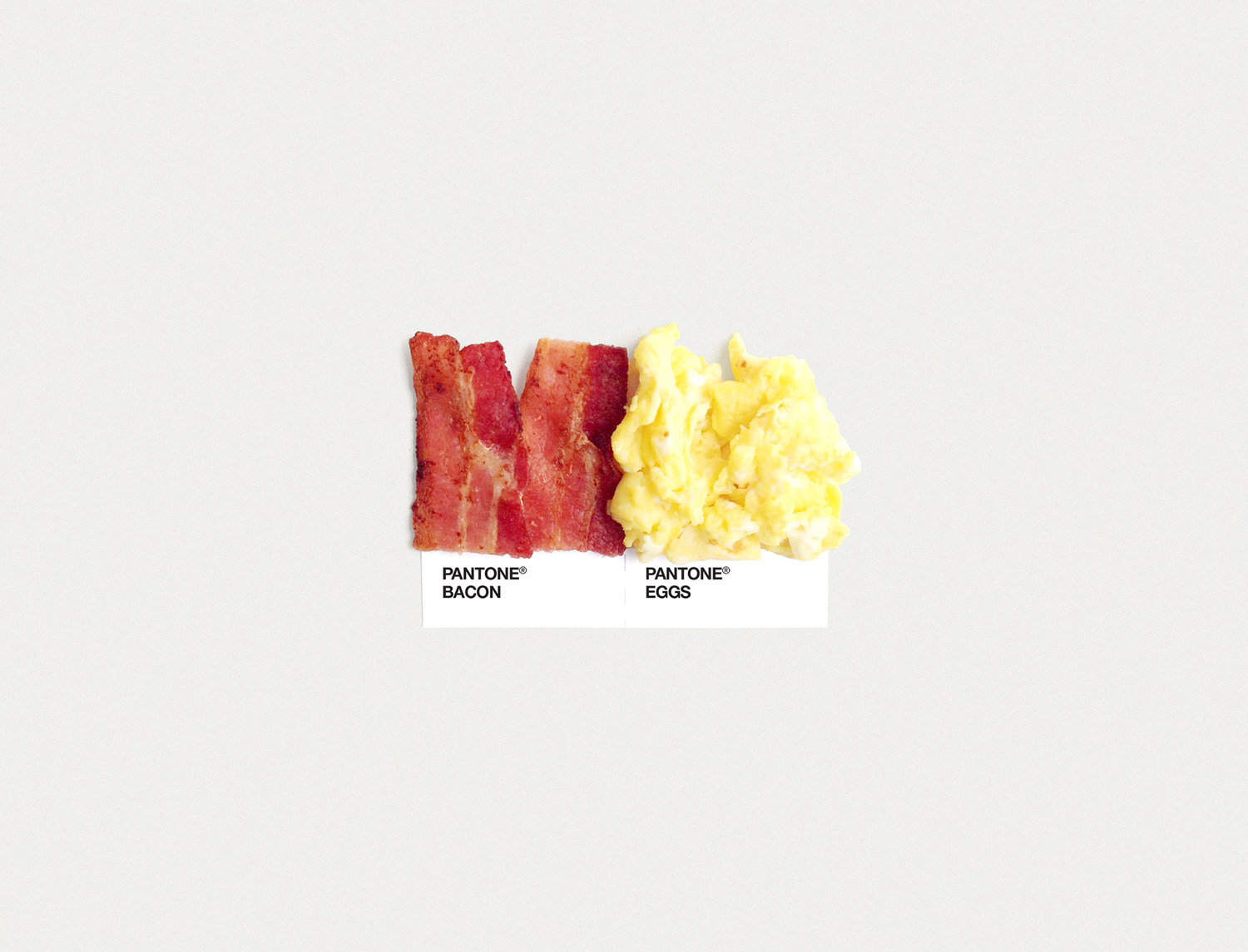
When our favourite things come together, we feel compelled to share. Food Art Pairings is a passion project that assigns popular snacks their own Pantone swatches, created by the folks at Dschwen, a creative studio based in Minneapolis. Their brief project rationale: “After years of matching pantones, it was time to change things up. We were also hungry.”

We love these pantone pairings because a: they are clever, and b: they feature some of our favourite snacks. These simple photographs each tell a huge story and the studio’s rationale speaks well about the ways our creativity is driven by our experiences, inspirations and every day interactions.

Here at Snack, we believe in fresh thinking. When we leave the office, our creativity doesn’t turn off, it continues to be ignited by every experience and event we encounter. And we bring this back to work with us. Challenging ourselves in creative ways outside of the day-to-day demands of work allows us to serve up new and innovate ideas for our clients.

Appleby Quarterly Redesign by Samantha Murray

The Snack team is pleased to unveil our latest design project! Last summer, Appleby College invited Snack to throw our creative toques into their RFP ring for a re-imagining of their school magazine, Quarterly.
 
After being selected for the job, we got to work exploring cover options to help guide the potential direction of the page layout.

We provided four covers for review and discussion, and to get a better sense of what direction the client wanted to take. A key element of those discussions was our recommendation to change the magazine’s masthead – shifting the focus from "Appleby" to "Quarterly," which they embraced.
 
Taking all of their feedback into consideration, we made a few more modifications and nailed down the creative direction. The end result features a handsome greyhound – a nod to Appleby’s school mascot – and leverages a large, bold and bright image for a striking first impression.

We then streamlined the page layout, balancing large and small imagery throughout, created ample whitespace and bumped up the body copy a notch for improved readability. We also provided creative direction and concepts for several photoshoots.
 
The final product is bold, fresh, clean, consistent, easy to navigate, and fun to read. And the best part? We helped find a new way for the school to connect and engage with their alumni.

We're proud to say this project was a win/win/win – for our client, their readership, and for Snack!