The Snack team is pleased to unveil our latest design project! Last summer, Appleby College invited Snack to throw our creative toques into their RFP ring for a re-imagining of their school magazine, Quarterly.
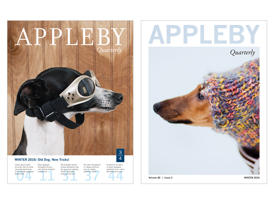
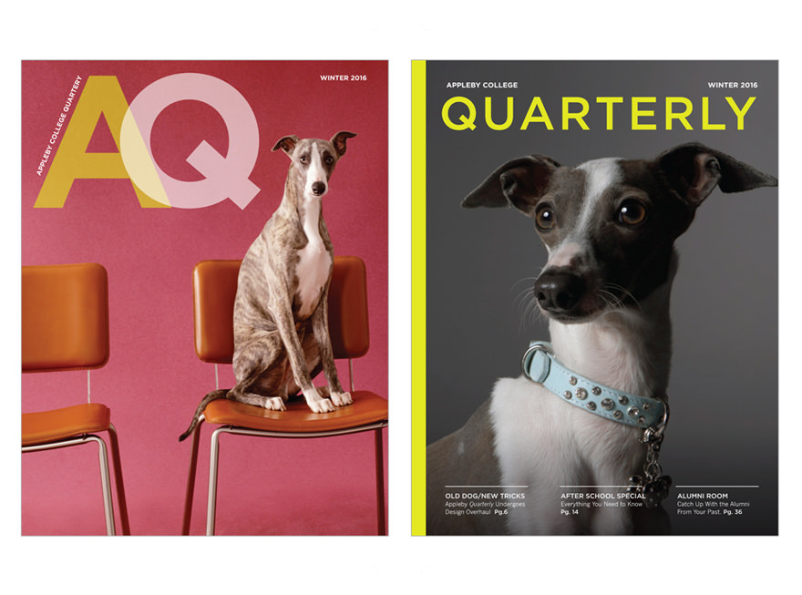
After being selected for the job, we got to work exploring cover options to help guide the potential direction of the page layout.
We provided four covers for review and discussion, and to get a better sense of what direction the client wanted to take. A key element of those discussions was our recommendation to change the magazine’s masthead – shifting the focus from "Appleby" to "Quarterly," which they embraced.
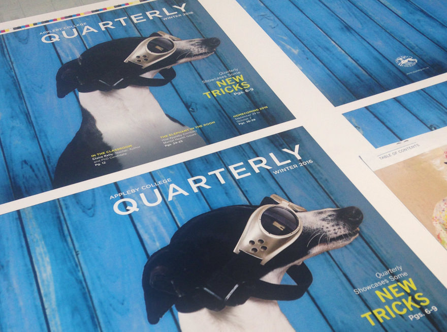
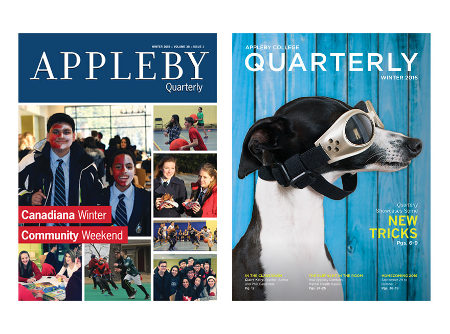
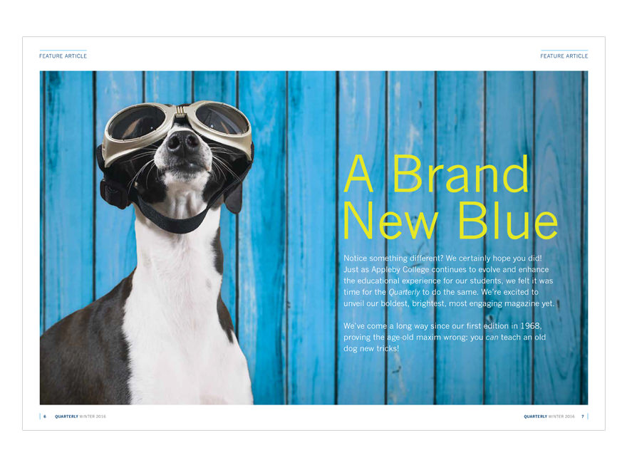
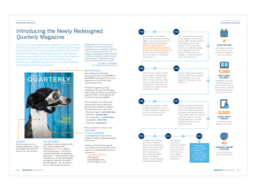
Taking all of their feedback into consideration, we made a few more modifications and nailed down the creative direction. The end result features a handsome greyhound – a nod to Appleby’s school mascot – and leverages a large, bold and bright image for a striking first impression.
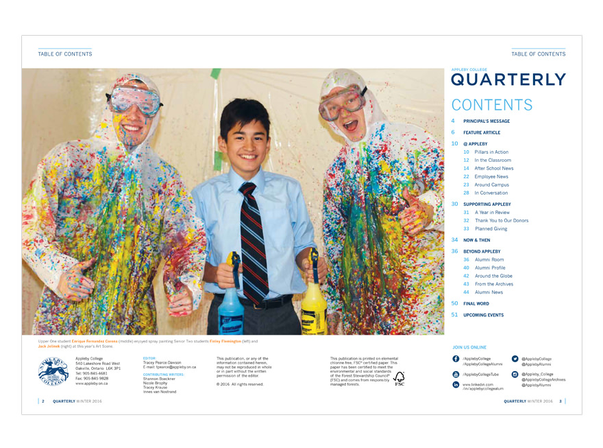
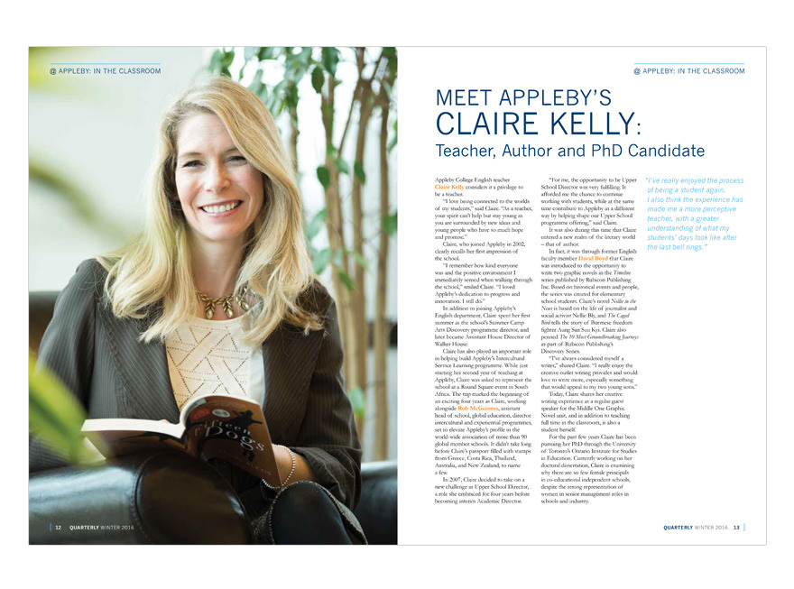
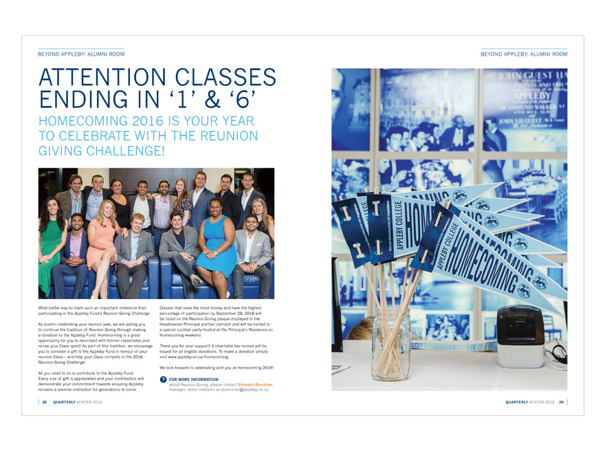
We then streamlined the page layout, balancing large and small imagery throughout, created ample whitespace and bumped up the body copy a notch for improved readability. We also provided creative direction and concepts for several photoshoots.
The final product is bold, fresh, clean, consistent, easy to navigate, and fun to read. And the best part? We helped find a new way for the school to connect and engage with their alumni.
We're proud to say this project was a win/win/win – for our client, their readership, and for Snack!

